How to use Optimized Responsive Images

If you’re a designer or a developer, it’s clear to you that you need to manage the assets and your user images for different devices and screen sizes. There are also two types of images that you need to work with, the standard images included in the tag <img> and the background images included in the CSS styles. We’ll discuss solutions to these problems and how Piio works in each case.
HTML Image Tag
Resolution Switching
To switch images based on a resolution with the image tag, Mozilla Web Docs recommend using srcset, you need to define the breakpoints based on screen width, plus you will have the original image loaded in the src attribute in case srcset is not supported in the browser.
* To properly test how this examples work, we suggest adding two custom devices in chrome dev tools, one with a screen width of 1024px and pixel ratio of 1x and another one with the same width and a pixel ratio of 2x. We will compare how the images load in each case, also keep the disable cache option enabled, chrome may use the image available in the cache instead of the best image for that resolution.
Standard <img> tag using srcset
With this example, we can see how the image loaded is related to the screen width and pixel ratio.
A valid source size list is a string that matches the following grammar:
<source-size-list> = \[ <source-size># , \]? <source-size-value>
<source-size> = <media-condition> <source-size-value>
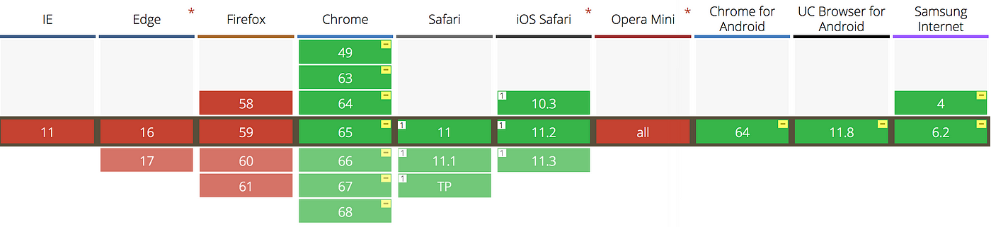
<source-size-value> = <length>Support for Browsers

There’s also a HTML tag <picture> that can be used and generates a code a little bit easier to read.
Using Piio on an <img> tag
First of all, you need to include the JS library with the configuration for the domain. We will modify the<img> tag and set the url of the image under thedata-piio attribute, and we’ll set the src attribute to a transparent base64 PNG. This prevents the browser to show the “broken image” icon to the user.
Perfect Responsiveness & Pixel Perfect Images
The result of loading the image with Piio generates significantly better results than the usage of the standard img tag with srcset, plus the code is much simpler. Piio understood not only the screen size but also the container where our JSFiddle is loading the image. If we inspect theimg tag containing the image the width is 601px, so Piio did exactly that, loaded an image, resized and optimized in real-time with a width of 601px and 601px height.
The image loaded with the standard HTML solution was 1024px width since it’s actually a static image, we can check our site and understand in the context of that media query what’s the actual size of the container, but replicating that through our whole site can be a problem. In most cases you’ll serve images by approximation and the browser will be resizing those images on the run and you’ll lose some quality there. Piio’s job is to generate pixel-perfect images giving a sharper and incremental experience.
I’m ok with using srcset, yes, you might think that, but you don’t want to be in the same place that these guys are.

Full disclosure, I love Unsplash ❤️, I use it all the time, their images are great! But guys, come on… give Piio a try ;)
Slow Download Effect
Le’ts say that I’m a lazy developer, so I don’t like resizing images I also don’t care about speed because I have a great broadband connection and if my users are having issues with speed, then they should man up and increase their broadband plan. But you love to download images from Unsplash, so we compared an image downloaded from Unsplash, uploaded to S3 and anotherone served from Piio. This is the result:
S3Piio

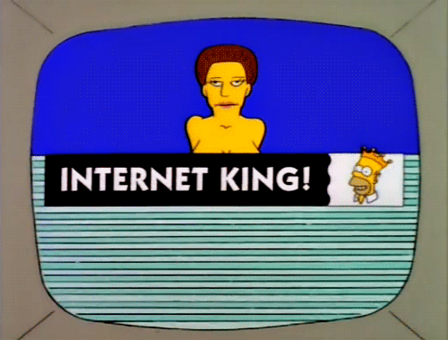
Load times are exaggerated because of the original size of the image, but the download effect is something that’s visible and annoying in some websites images. This is not entirely related to responsive images, but it is with user experience and is something that you don’t want happening in your website. Unless you’re the Internet King.
Background Images through CSS
For background images using multiple breakpoints we can use a very similar solution, we use the CSS property called image-set, the srcset is actually modeled after image-set, so it’ll have a similar syntaxis.
The code will look like this for the same example.
background-image: image-set("bird-2048w.jpg" 1024w, "bird-2048w.jpg" 2048w);
Browser’s support for this is not very good, even with chrome you need to use the -webkit- prefix.
Let’s see how the standard implementation will look like with the standard CSS background and with Piio. We created an example with two divs with background images loading with a media query and from S3 storage and the other one loading with Piio.
As we were able to see in the previous <img> example, the browser is rendering the image based on the media query and the screen size, but it’s rendering by approximation when the actual container size is 300px. Piio manages to inherit those CSS properties and get an image that is 300px wide for standard displays and 600px for retina. If you have a device that has a pixel ratio of 2.625 (as my OnePlus 5T) piio will do 300 x 2.625 = 787.5, and then get an image from the API with a width of 788px.
Conclusion
There are ways to use standard HTML tags and properties to present the images to your users in a better way depending on the device they are using. This requires to add more code to your HTML and CSS, plus you need to know and specify the size of your images beforehand, either using a script or a 3rd party API to resize them.
With the many different types of devices and screen sizes we’ve today, it’s impossible to code and adapt your website to every situation (or you’ll end up with something similar to the Unsplash code we showed). This needs to be done automatically, not only to provide the best experience for your users but also to be able to scale when new devices and screens are out.
This is why we created Piio. Some other Piio features are:
- Images are delivered through an extremely fast and reliable CDN like CloudFront.
- We serve WebP format when it’s available for the browser
- We use lossless algorithms.
- Average of 50% compression for most of the websites
- We’re continuously working and improving our JS library and API.
- You don’t need to change how you’re managing your storage
If you need to manually compress, crop o resize images, you can use a tool we developed at https://resizeimages.com
Hope you enjoyed the post, here’s a hedgehog surfing the web with an ice cream
Originally posted on: https://blog.piio.co/2018/04/09/how-to-use-optimized-responsive-images/