Art Direction: Showing different images based on device aspect ratio
It comes a time on the design process were using the same image for desktop and mobile devices doesn’t work. Using a wide hero image on the desktop may look nice, but when you go to a mobile device, the details on the image get lost, and the products are barely visible; not to mention that text might be too small to be read properly. That’s when Art Direction comes into play.
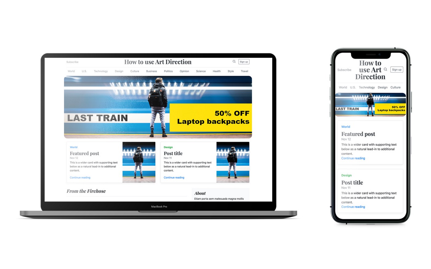
Let’s look at the following example:
How to fix this? Using Art Direction
Art Direction will allow you to communicate successfully with your audience, depending on their device screen size. You can specifically choose to focus on some aspects of your image that might lose detail on smaller devices.
We need to identify which elements we want to focus on and that we will need to re-order.

Enlarge those elements and change the image aspect ration to fit mobile devices better. Initially, we used an image that was 2400x800px.
The new image for mobile will be 1800x1200px. It will have a more squared aspect ratio. After applying the changes, the new design looks like this:

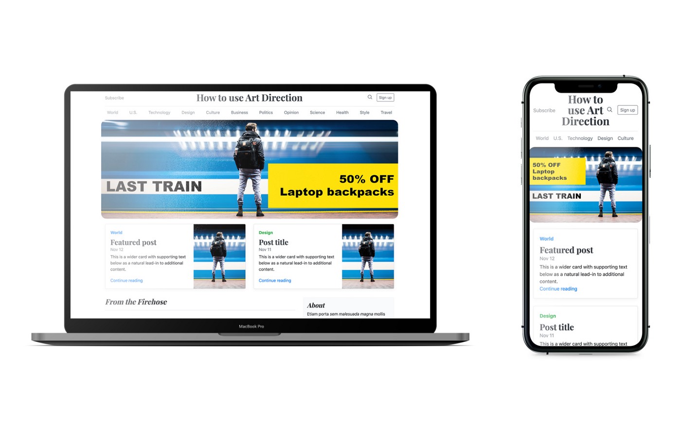
Art Direction: The Result
Different image sources for mobile and desktop, generate a more personalized experience depending on the user device. Comparing the two devices side to side, we can see how things have improved.
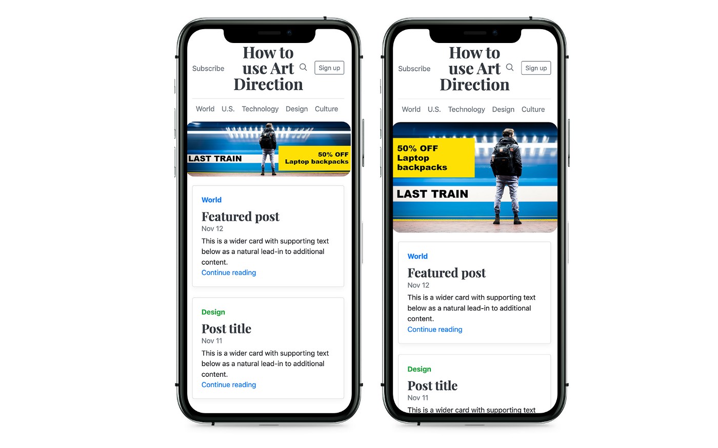
Here is the comparison between the two devices.
How to change your code to use multiple image sources
Originally you will have the following HTML code on your hero image.You’ll need to add the element to be able to pick different sources for your image.
Then you’ll define what the different screen sizes are and what image source to use on those screen sizes.
* Play with the sizes (1x, 0.5x, 0.25x) in the result of the CodePen widget to see how the image changes by changing the resolution
In this case, when the screen size is smaller than 799px then the image for mobile will load instead of the desktop one. The img tag inside at the end is there because some browsers might not be compatible with the picture element.
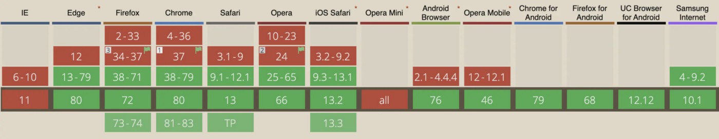
Here is a list of the compatible versions of each browser.
To learn more about the specification of the picture element click here
Optimizing them
You can manually optimize your images for free using resizeimages.com, or you can use a service like Piio which also has a free plan for low traffic websites. (FYI: I work at Piio)
Using Piio
Let’s first take a look at the original picture element
To use Piio on the picture element, we will need to set a transparent gif on the secret attribute and then set the URL of the image in the data-piio attribute.
* Play with the sizes (1x, 0.5x, 0.25x) in the result of the CodePen widget to see how the image changes by changing the resolution
If you want to learn more about how image optimization works, continue reading here!
This article was first published at: https://blog.piio.co/responsive/art-direction-showing-different-images-per-device/